
Showcasing data visualization projects built in D3.js.
My Design Role
UX/UI Designer
The Teams
1 UX Engineer
1 Data Analyst
1 UX/UI Designer (me)
Deliverables
Data Visualization
Mockups
Write-ups
Tools
D3.js
JavaScript
Photoshop
Sketch
Excel
RStudio
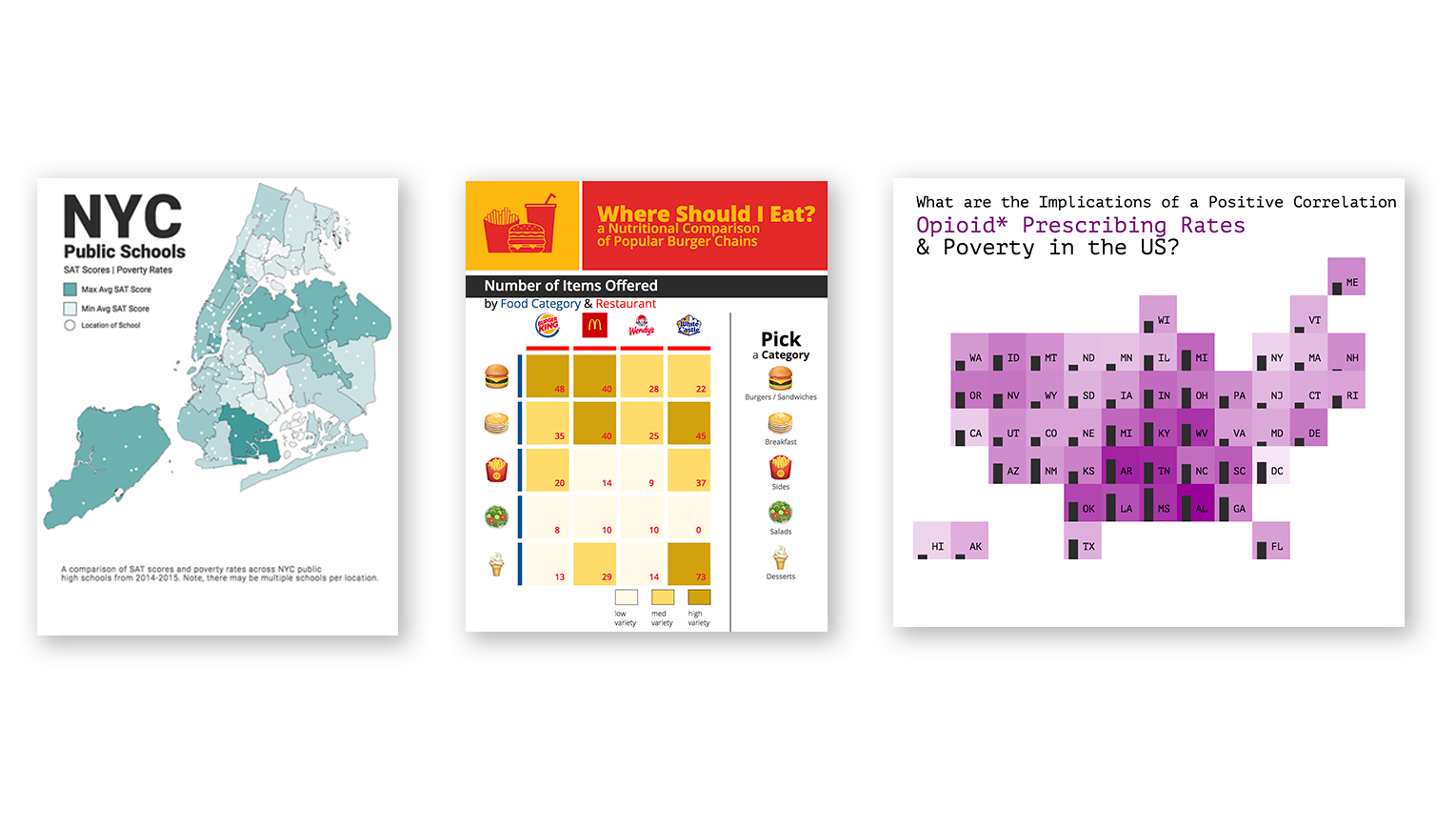
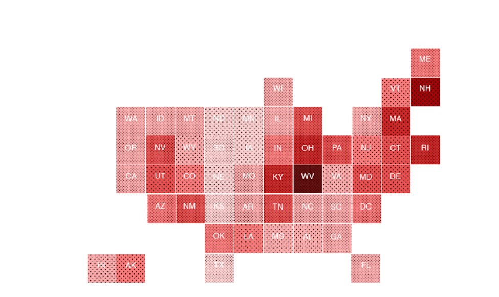
Our visualization depicts the high positive correlation between poverty rates and opioid prescribing rates in the US. States with high poverty rates are more likely to also have high opioid prescribing rates, suggesting that poverty plays a role in opioid consumption. This visualization is meant to evoke curiosity and further examination of this subject matter. Why are the poor more likely to consume opioids? Does job history and/or unemployment and depression play a role? What might help reduce opioid prescribing rates in states with high poverty rates?
Mockups
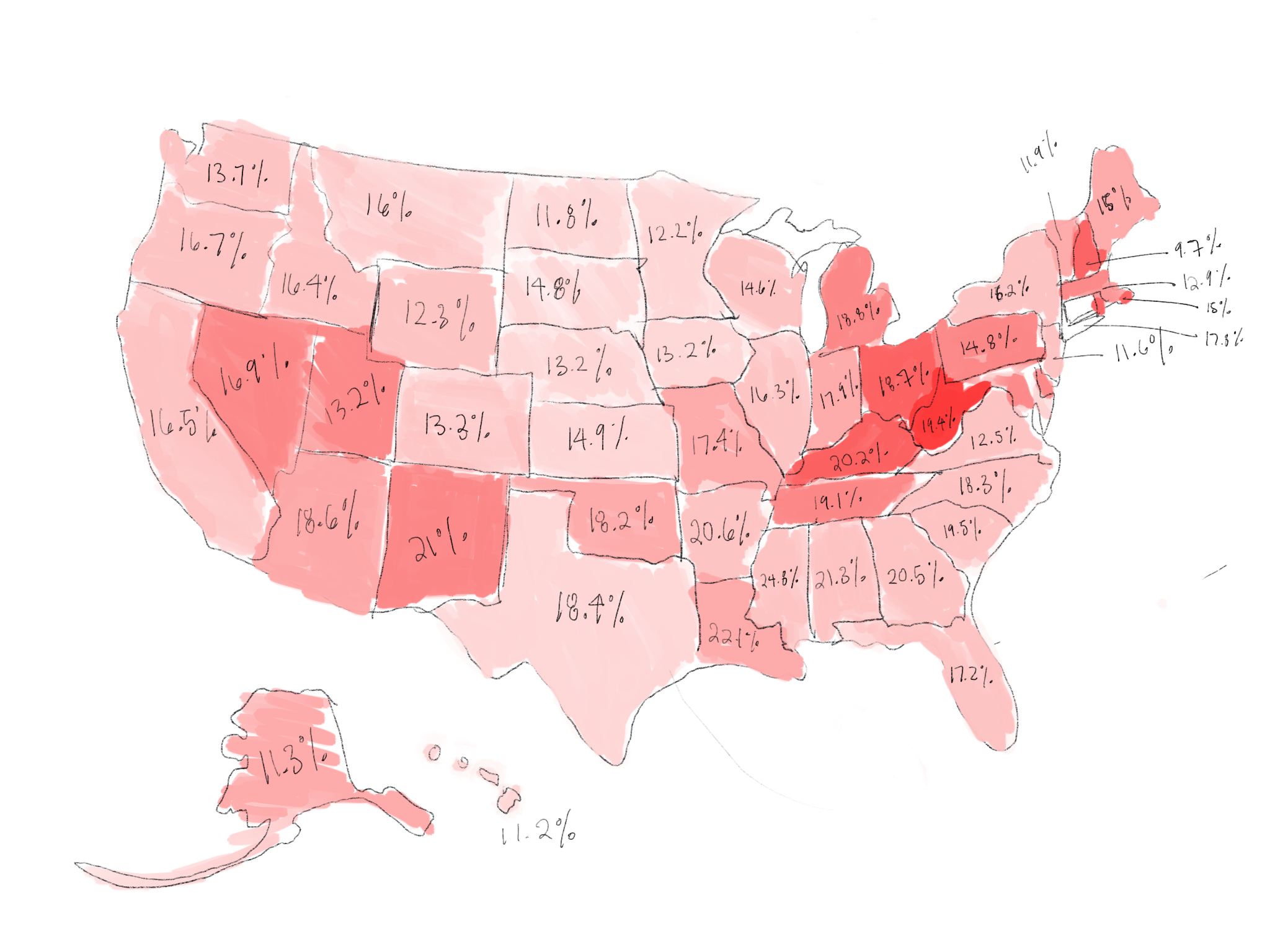
Initial sketch showing map, color intensity scale and percentages in text.
Mockup 1
Mockup 2
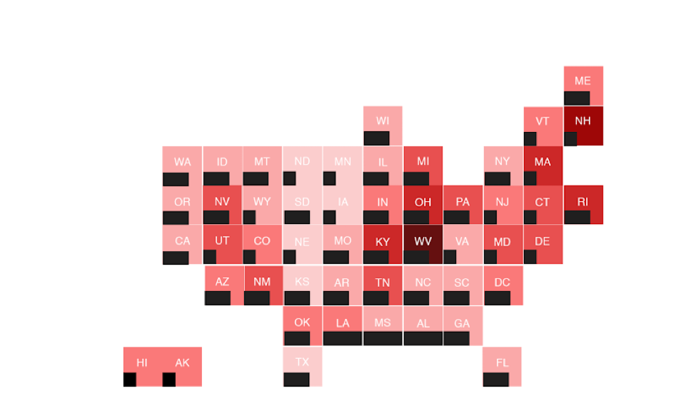
Mockup 3
Final Design
Link to project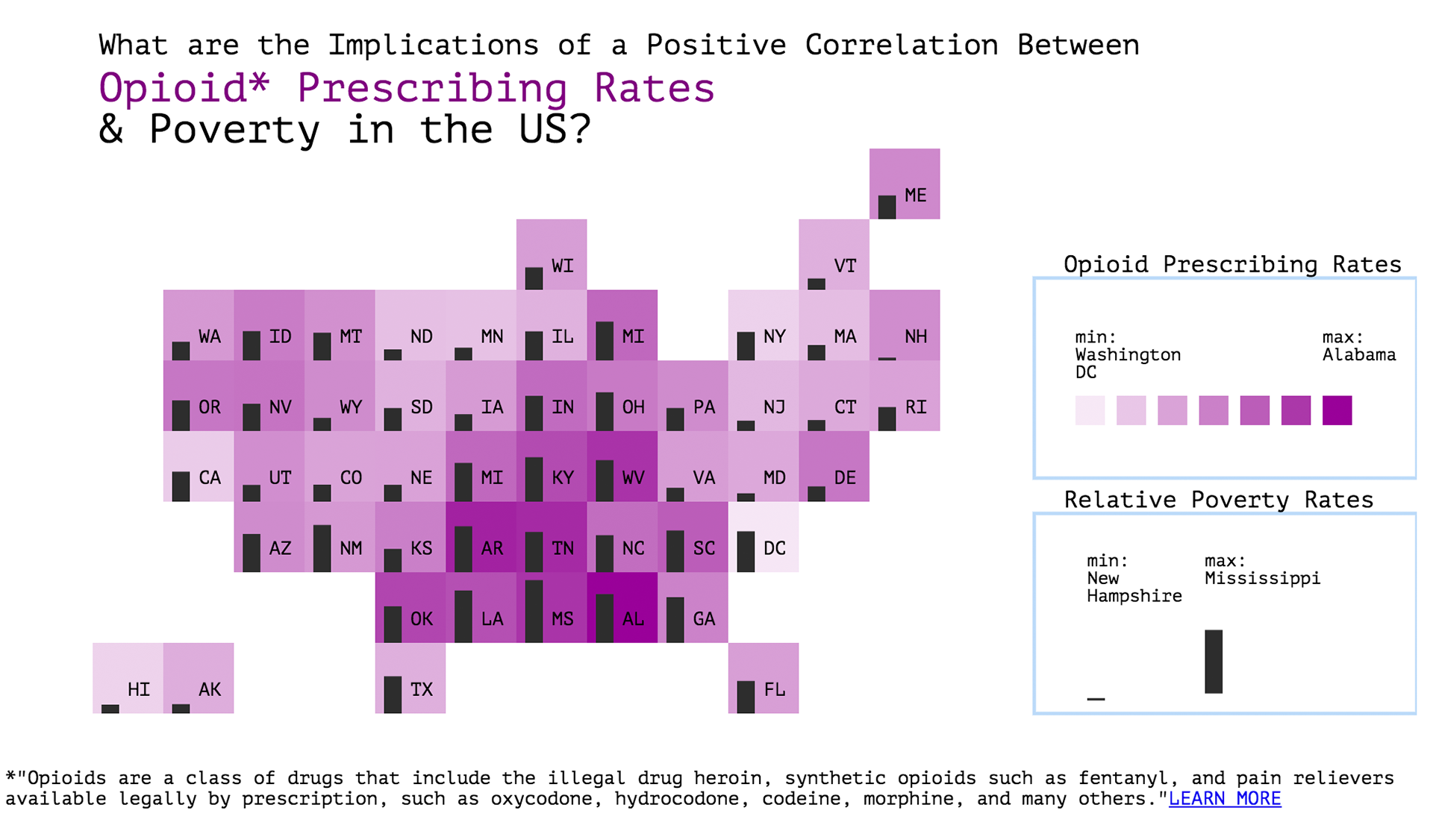
Research shows that Americans rarely know their caloric intake, specifically when it comes to their choice fast food burger. Without realizing, you can devour 1,500 calories of a 2,000-calorie recommended intake in one sitting at McDonald’s. These meals often come with loads of sodium, fat, and cholesterol. The goal of this visualization is to help fast food frequenters be more aware of the nutritional values of the fast foods they consume and ultimately impact their fast food consumption decisions.
Mockups
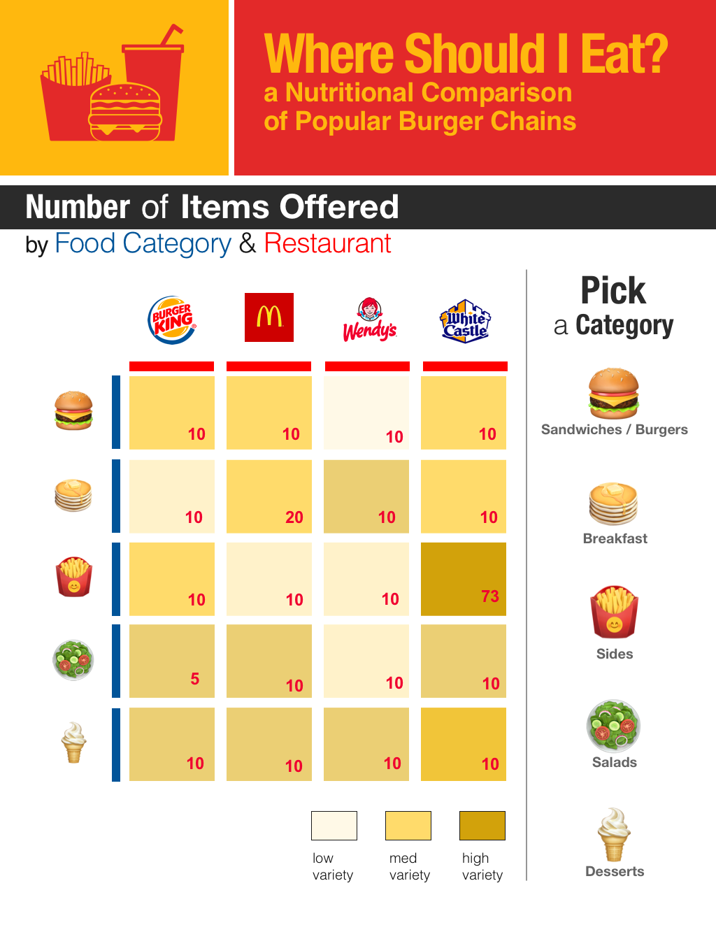
Fast-food grid
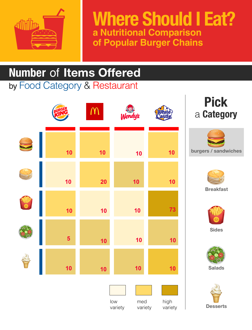
Item hover
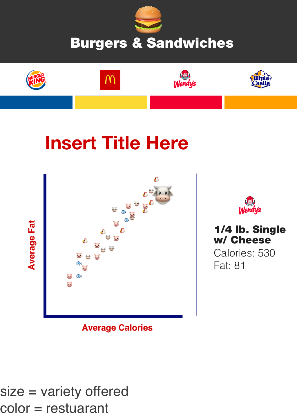
Fat / calorie plot 1
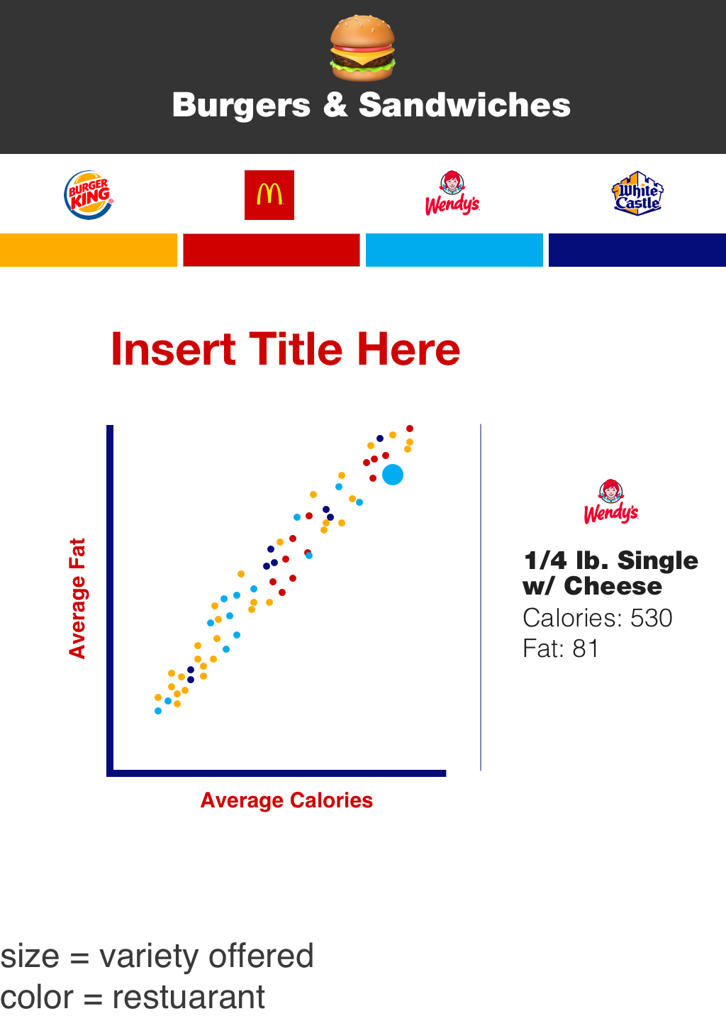
Fat / calorie plot 2
Final Design
Link to project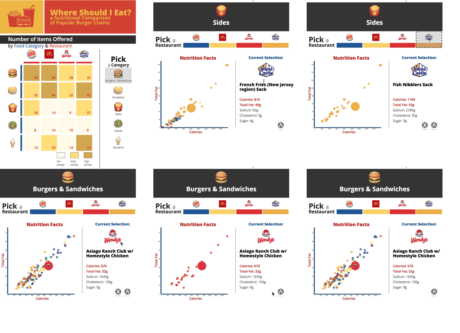
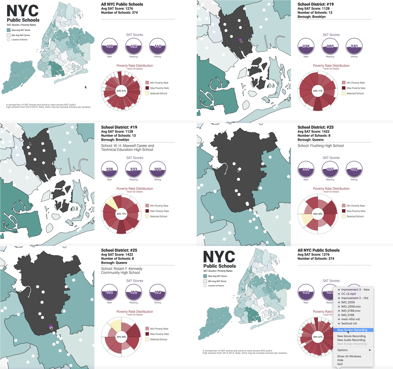
Within NYC, there is an inequality between public high school academic performance. Often, this discrepancy is seen correlating with the percent of students attending an institution who fall below the poverty line. As students below the poverty line decrease, average SAT scores increase, and vice versa.
Mockups
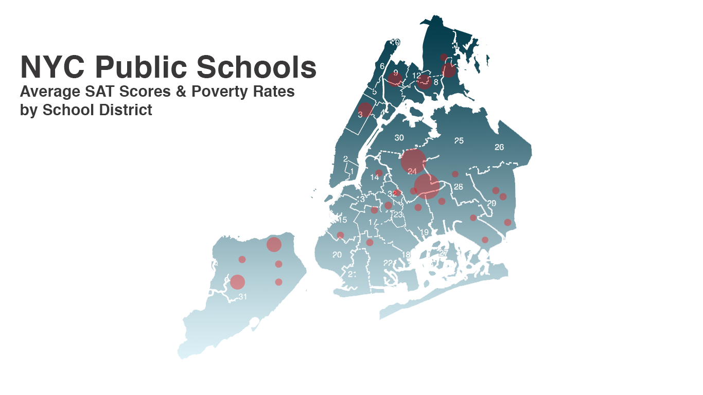
Mockup 1
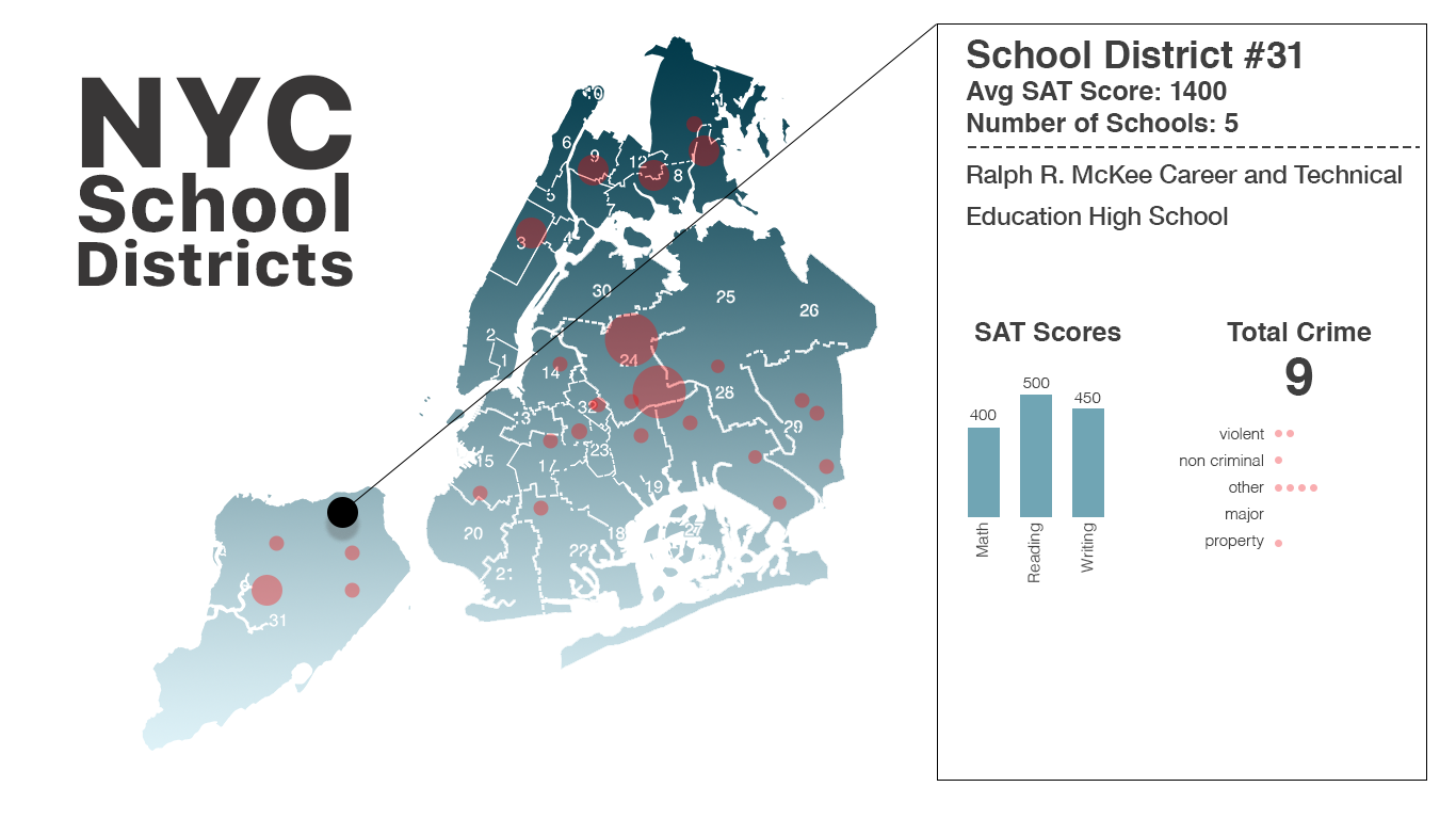
Mockup 2
Final Design
Link to project