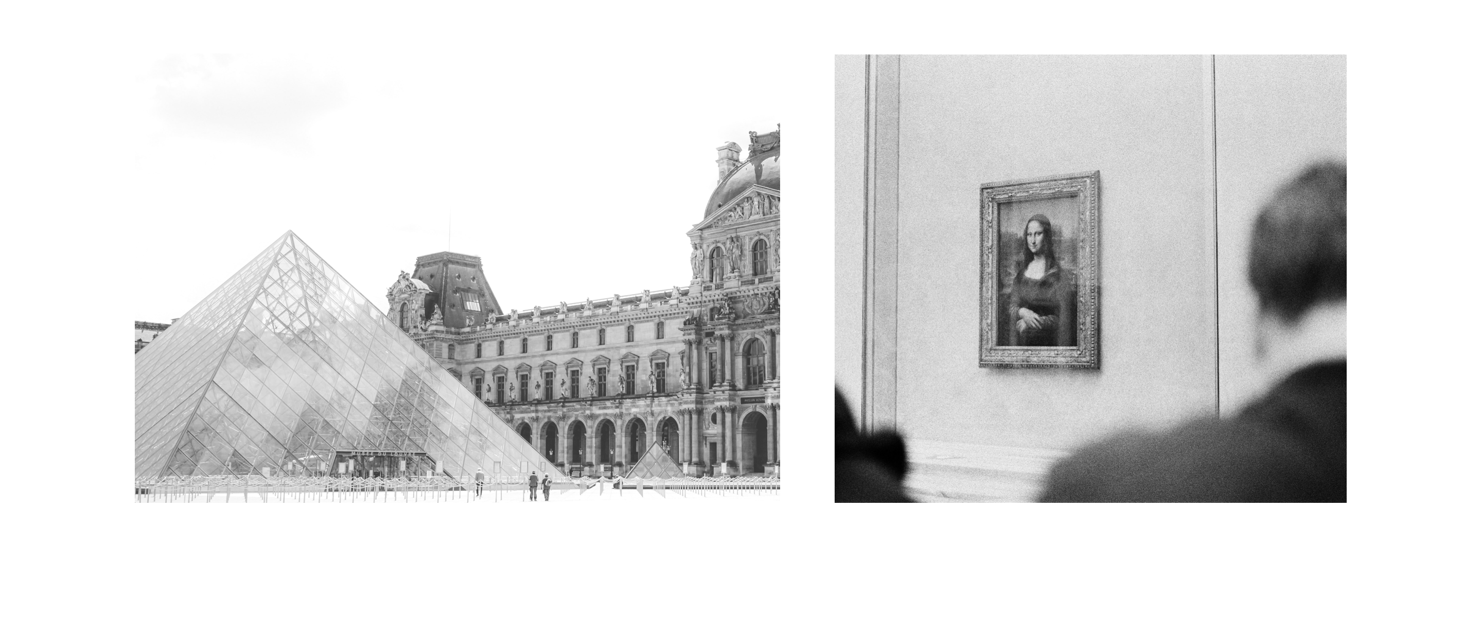

This 4-hr design challenge was part of my hiring process at IBM.
The challenge:
Redesign parts of a website for the world’s largest museum: The Louvre.
Your co-worker, a user researcher, has analytics that show many users are looking for information
on prominent pieces of art, but are leaving before they find what they want.
Propose changes to address this feedback.
Users can’t find relevant information on prominent pieces of art at the Louvre because it is likely their first time conducting research on the matter, and thus they are unsure of what to look for specifically.
The 5 "Whys"
The first thing I did was employ the 5 Whys method — where you ask the question ‘why?’ recursively 5 times — to get better understanding of the specific problem to solve for.
Start: users can't find information relevant to prominent pieces of art at the Louvre.
The specific problem
Users can't find relevant information on prominent pieces of art because they don't know what they're looking for.
The Louvre's website
While the Louvre’s website provided rich quality content on a large selection of art, I felt that improvements can be made to address the specific problem I’ve outlined for this challenge. Someone visiting the website looking for prominent art pieces can easily get lost in the details presented here.
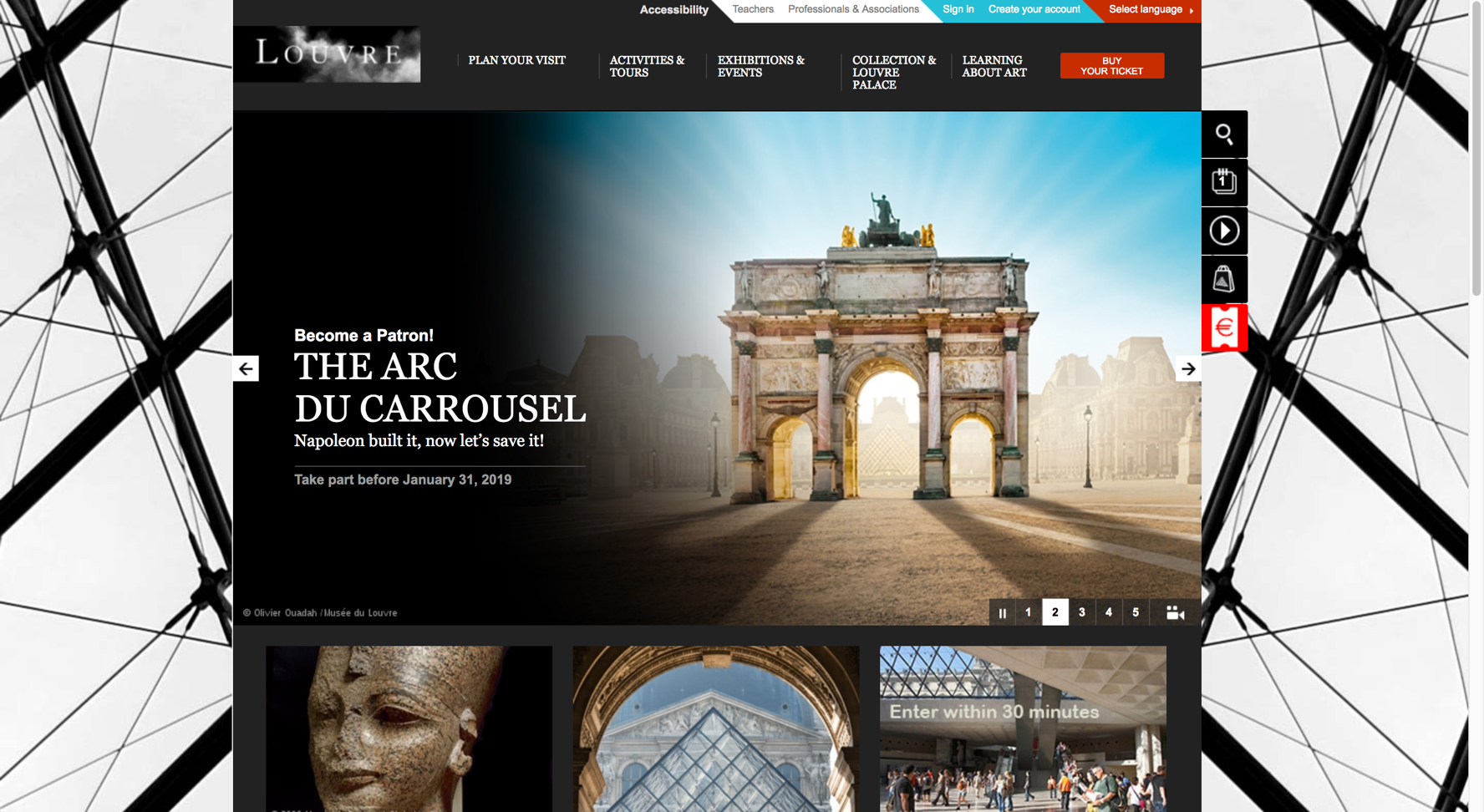
The Louvre's homepage - above the fold
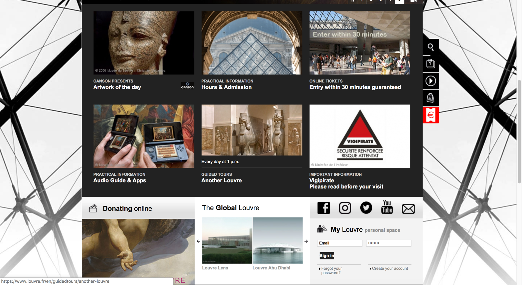
The Louvre's homepage - below the fold
What we know about our users from the prompt: the user enters the Louvre website looking for information relevant to prominent pieces of art.
Now, why a user do this?
Because this was meant to be a 4 hr (max) exercise, I had to make some assumptions.
Assumptions
Users are deciding on whether or not they should buy Louvre tickets.
Users are visiting the Louvre soon and want to plan out the details of their trip.
“Prominent” includes permanent and well known Louvre fixtures such as the Mona Lisa.
User story 1

A young professional is planning an upcoming vacation to Paris, France and is debating on whether or not to visit the Louvre. She wants to know what the museum has to offer in addition to the Mona Lisa.
User story 2
An American tourist in Paris has tickets to visit the Louvre in the coming days. She wants to learn more about the famous works of art on display so she can plan her trip and hopefully not miss out on anything.
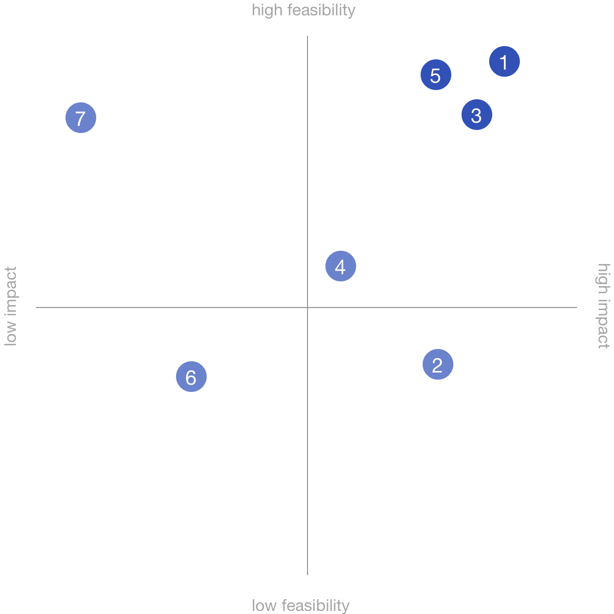
Here are 6 unconstrained ideas to solve our specific problem, followed by a translation into realistic features.
After coming up with some possible solutions, I plotted them on a feasibility / impact matrix to prioritize. My design focuses on the ideas with a combination of high impact and feasibility -- mapped on the top right of the matrix.
User flow

Final design
The solution starts with idea #5 in providing an iconic / clearly recognizable piece of art — the
Mona Lisa — front and center of the home page with the headline “Prominent Art Pieces,” giving
the user a clear entry point for sought after information.
Next, adopting idea #3 to not make the
user thing. The proceeding pages present the different categories of “prominent art,” along with
image galleries for each one. This adds some progressive disclosure, giving the user some
digestible information.
Lastly, when specific image is clicked, rich, detailed information is
displayed for that particular art piece — idea #1.
This was a 4-hr project that was never meant to be a complete redesign. My intention here was to showcase my design process. My solution — a med-fi wireframe — is meant to fit seamlessly into the existing Louvre design by leveraging already existing content and design patterns, which are common constraints. If I had more time, I would’ve done a few things differently. First, starting with a validation of my user stories, which can be achieved through interviews. Secondly, I would’ve liked to use terminology that resonates with the user. I stuck with “prominent art” because that’s what was in the prompt. But, does this verbiage mean anything to our users? A simple A/B test can help answer this question. Lastly, I would’ve loved to pursue idea #7 a little further. It was plotted as having a high impact, but low feasibility. It would’ve been fun to spend a couple more hours flushing out the idea of 3D experiences that intertwine digital with physical space to see if there are attributes there that can be applied to a more feasible solution.